
It’s estimated that at least 60% of #LinkedIn members use the mobile app. Further, a poll I conducted on LinkedIn showed that 65% of the participants use the the app more than their computer (desktop or laptop).

Those who chose the the computer platform enjoy the ease of use; whereas those who chose the app cite convenience as their reason. Case in point: if I’m writing a long post, I’ll be at my computer. If I’m waiting for my daughter to get out of soccer practice, I’ll be on my LinkedIn app.
I’m going to dive into eight major LinkedIn features on both platforms and discuss how some of features differ between the mobile app and computer platform, so you can understand the advantages and disadvantages of using both.
1. Homepage/Feed
There’s no better place to start than the home page. It isn’t very sexy on the app, but what do you expect from a device that’s approximately 6″x3″?
This is where you’ll usually land if you’re opening the app for the first time in the day. Otherwise you’ll land on whichever page was opened last. This is also where your (ideally) relevant conversation is streaming.
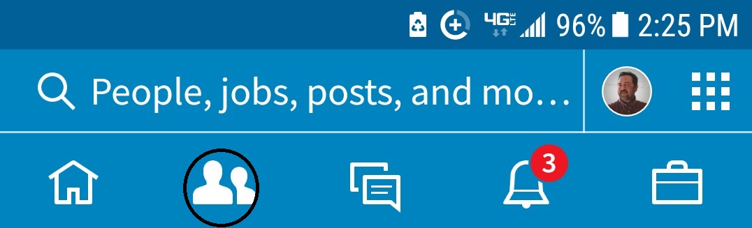
There are many features located on the home page that aren’t obvious to the average user. The features that are easy to find are: Home, My Network, Post, Notifications, and Jobs. In the past they were in a different order than the computer.
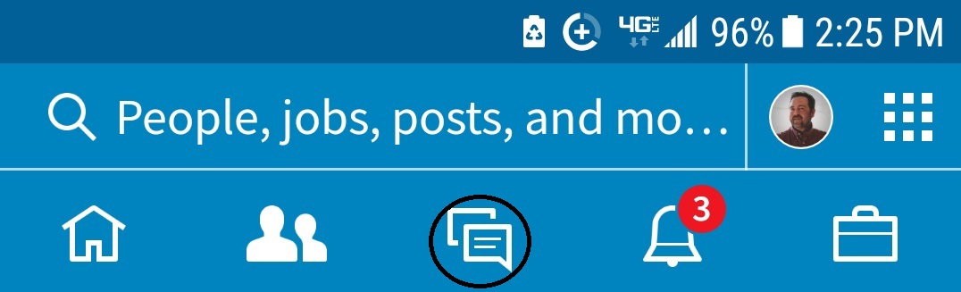
Rest assured that the mobile app contains many of the features the computer provides. It’s just a matter of finding said features. One thing that is hard to get used to, at least for me, is locating the Messaging icon on the App. It’s at the top right-hand corner.
The computer platform lays out the features like a landscape canvas (image below). The icons (Home, My Network, Jobs, Messaging, and Notifications) are listed at the top of every page. Groups is conveniently hidden in the Work drop-down. Note how they’re listed in different order on the computer.

Some nice information at your fingertips on the computer platform on the left-hand side are your photo, complete Headline, Who Viewed Your Profile (within the past 90 days if you have premium) Views of your posts, and Your Groups, Recent Hashtags, and others. To access this information on the App, tap on your photo.
2. Search
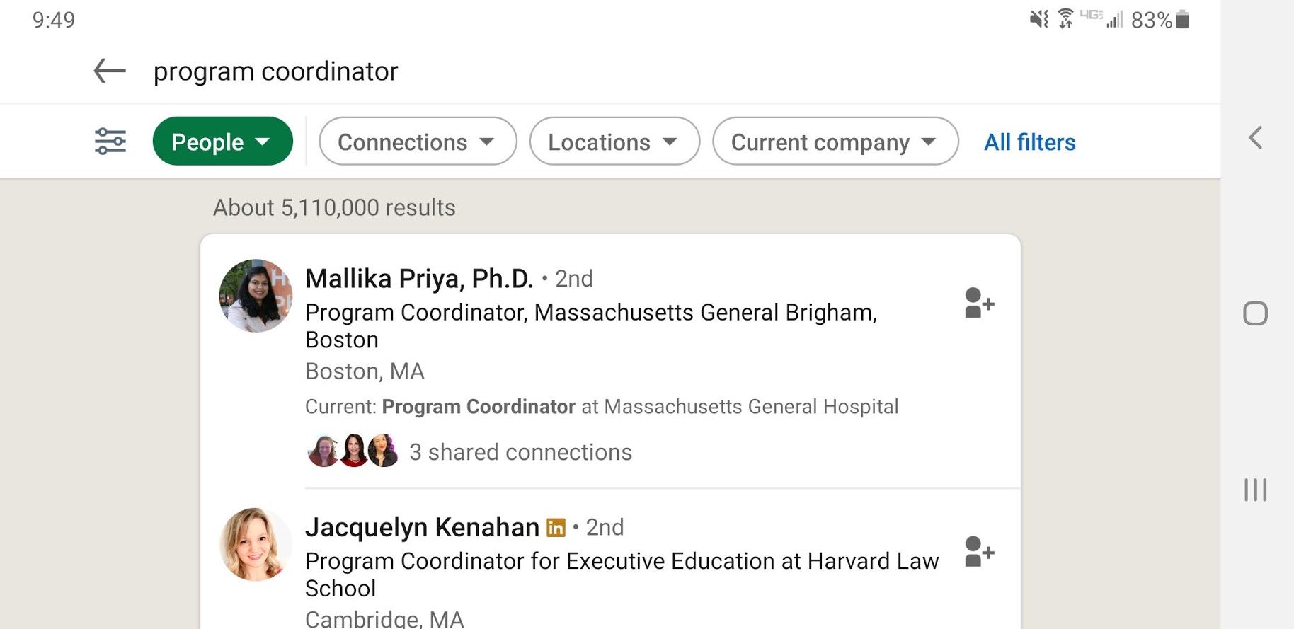
This feature is extremely powerful. With it you can search for—in this order—People, Posts, Jobs, Companies, Groups, Schools, Events, Courses, and Services. You’ll have to swipe left to find Schools, Courses, Events, and Services.
Every feature you find on the computer (image below) is available on the App, save for All Filters, which we’ll get to shortly.

Doing a search. If you’re searching on the App for people, simply type in an occupation like “program manager” and you’ll have the option to continue your search for the occupation in People, Services, Jobs, Posts, Courses, Schools, Events, Groups, and Companies. Why LinkedIn lists the items in a different order beats me.
Note: Services is a new feature for people who are offering services in various categories. If you select it, you’ll get a drop-down that shows categories like: Consulting, Coaching & Mentoring, Marketing, Operations, Business Consulting. You can also select Add a Service and you’ll get a drop-down of a plethora of services like Financial Analysis, Accounting, Advertising….
Using Search on the App is not as easy to navigate as it is using the computer, but you can find almost all you need with Search.
Filter people by or All filters
This is a powerful feature within Search. If you select People as your search preference, you’ll see a symbol you’ve probably never seen before. It resembles three nob and tubing wires (boxed out on top left of screenshot above).

Not as powerful as the desktop version, it still allows you to narrow your search by: Connections degree, Connections of, Locations, Current company, Past company, School, Industry, Profile language, and Open to.
The computer version provides more features than the app, and Filter people by is way more friendly on your computer than your phone. There are a couple of more options to find people with the computer platform, which include Service categories, and Keywords.
3. Share a post
To start a post, you might have to look hard to find it. In image at the very top, the icon resembles a white cross in a grey box. Clicking on the icon gives you the option to Write a long post of about 1,200 characters but as I said above, writing it with the app can be difficult.
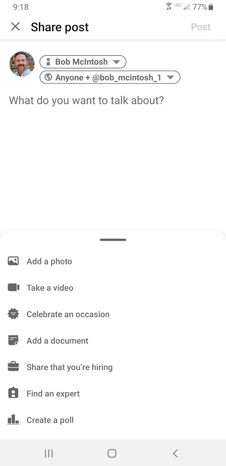
Other features that come with starting a post are: Add a photo, Take a video, Celebrate an occasion, Add a document, Share that you’re hiring, Find an expert, and Create a poll. The app separates itself from the computer with the Take a video feature. It’s not possible to do on the computer but easily done with the app.
Somewhat related to Start a post is a new feature that hasn’t rolled out for everyone. It’s called Cover Story and allows you to record a 30-second elevator pitch. At this writing I haven’t recorded my elevator pitch, but I’ve seen some very good ones.
The computer platform doesn’t allow you to take a video, rather you have to upload it to your hard drive. With your app, you can create a video straight from it.
However, the computer platform allows you to write and revise a Newsletter and create a LinkedIn Live video. It’s a bummer if you only have your phone and want to do any of the aforementioned.
4. Messaging

The most noticeable difference between the mobile app and the desktop for Messaging is that the app’s version is truncated (to left). Only by clicking on your connection’s message can you read the stream of conversation.
On the desktop you can see the most recent messages you’ve had with a connection or someone with whom you’ve shared InMail. But this is expected, as the desktop has a larger surface.
Both the mobile app and the desktop allow you to search by Unread, My Connections, InMail, Archived, and Spam, albeit in a different order. (Are you getting the sense that the desktop platform is becoming more like the mobile app?)
With both mobile app and the desktop, you can respond to InMails by choosing some buttons, such as Interested, Maybe later, No thanks and other intuitive short responses. Obviously LinkedIn considers this lazy way of responding to be intuitive and clever. I will admit that that I’ve taken the shortcut.
One noteworthy difference is that the mobile app has a feature that suggests an opening verbiage for messages, such as, “Hi (name), I notice you’re also connected with (name).” This feature is akin to LinkedIn’s default invite message. No thanks.
5. My Network

If you’re looking for the My Network icon, it’s migrated from the top to the bottom of the screen. Clicking on the icon brings you to a the ability to Manage my network, which shows your number of connections. It’s interesting that my number of connections is different from my computer (4,705) and the app (4,046). I wonder which is correct?
Other tidbits of information are: People you follow, #Hashtags you follow, Companies you follow, and other minor details. You can also check out how many Invitations and Sent invites that are pending.
Note: If you want to locate someone by occupation and other demographics, you can use All filters.
Also important to keep in mind is that LinkedIn will suggest people you know (to right). Don’t simply hit Connect, as the invite will be sent without giving you the opportunity to personalize it. Contrary to what many people believe, you can send a personal invite from the App. I’ve made the mistake of sending an invite sans personal invite. The secret, go to the recipient’s full profile on the App.
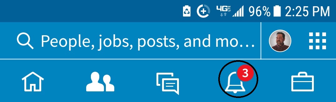
6. Notifications
This feature allows you to see what your connections have been doing:

- Who’s mentioned you in a post
- Liked your post, liked a post that mentions you
- Is starting a new position
- Commented on (someone’s ) post
The differences between this feature on the app and desktop are negligible and hardly worth mentioning. However, there is one major difference: the desktop seems to lag behind the mobile app. In other words, the streaming is slower on the desktop than the app.
7. Companies

Like the desktop, you have to use the Search to access your desired companies. The most important reason to use Companies is to locate people who work for your target companies, which is a bit more cumbersome with the mobile app than the desktop.
To do this you must type the company name into Search and choose People, and then use the Filter tool (boxed out on the image to the right). You can filter by:
- Connections (degree)
- Connections of
- Locations
- Current companies
- Past companies (not shown)
- Industries (not shown)
- Schools (not shown)
The only benefit the desktop version offers is the ability to search by Keyword. The other filters are superfluous. Such as Profile language and Nonprofit interests.
In my opinion, this is the most important feature LinkedIn provides, whether on the desktop or mobile app. This is where real online networking happens. In fact, I written an article on the Companies feature.
8. Jobs
You can search for jobs using Search just as easy as clicking on the icon. You avoid a step by using Search.

The Search feature allows you to find jobs, say in Accounting, and then narrowing them down to Location (allow your device to identify your location, if you like), and if you want to take it further, filter by:
- Most relevant
- Most recent
- Determine how many miles you are willing to travel
- Only show jobs with which you can apply Easy Apply
- Date posted
- Company
- Experience level
- Job type
- Industry
- Job function
When you’ve chosen a job to investigate, you’ll notice—because of the limited surface—the mobile app is not as robust as the desktop version. Some similarities are:
- Number of first degree connections
- Number of alumni
- Job description
- The person who posted the job
- Jobs people also viewed
- Easy Apply
When you open the LinkedIn app on your smart phone, you’ll see the power, albeit limited, it has to offer. You’ll also see that the desktop version closely resembles the mobile app. If I were to choose between the two, it would be a difficult choice. However, the prospect of opening up the laptop 10 times a day isn’t very appealing.


 This feature allows you to see what your connections have been doing:
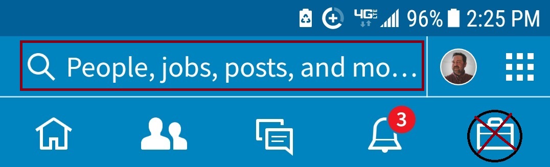 Perhaps the most difficult mobile app feature to navigate is Jobs.
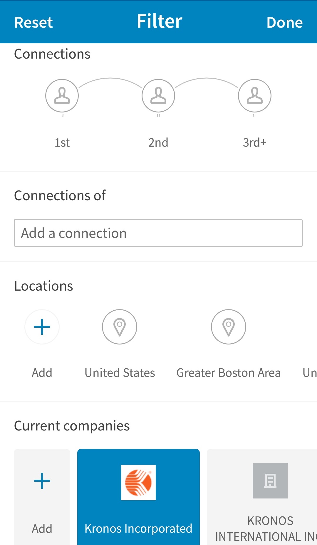 To do this you must type the company name into Search and choose People, and then use the Filter tool, as shown above. You can filter by: