
LinkedIn is at it again.
I guess when it comes down to it, I can be adverse to change. (I wrote a post claiming that LinkedIn made changes to its people filter feature just for the sake of making changes. ) But now that I think of it, the changes that LinkedIn made to All Filters aren’t that bad. In fact, some of them are quite nice.
So I’m going to go at the new changes LinkedIn made with an open mind and not be too judgmental. LinkedIn didn’t overhaul its members’ whole profile; just the top of it, which I call the Snapshot area. Nonetheless, this is important real estate.
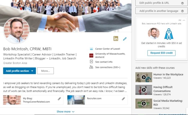
For the purpose of this post, I’m displaying my new profile followed by my previous one.
The New
The Old

Full disclosure: I’m not the first one to write on this topic; I just recently received these changes. So, without further adieu….
Background image
You’ll notice that the new version of my LinkedIn profile’s background image is smaller than the previous one. This is not a drastic change; however, I liked how the background image used to covered the whole screen.
What’s taking up the rest of the background image? Ads that are specific to you and only you can see. With every profile you visit there will be a different ad. On my profile today there’s an ad telling me, “Picture yourself at General Motors.” It’s a position for which I’m not at all qualified.
Photo
The photo (purported to be 20% larger), along with the information below it, has shifted to the left. Again, nothing drastic about this. Because our eyes read from left to right, I’m assuming this is LinkedIn’s purpose for moving the photo to the left.
One problem with the new placement of the photo is it might block something important in your background image, such as a logo or a piece of your background image you value. Some LinkedIn members will be struggling to re-position their image or replace it with a new one.
Name and Headline
Nothing new here, other than moving these two areas to the left. This was done to make room for the information mentioned below. Some say it’s easier to read text that is left-justified. I concur. However, center-justified text is more appealing to the eye.
This change is not enough to cause an uproar. I hope eventually LinkedIn will extend the number of characters (currently 120) for its members Headline. Some have benefited from it by using the mobile app to utilize the extra characters. I was not given that privilege, though.
Summary
This is the best change LinkedIn has made. The previous profile only displayed two lines, or approximately 40 words, on the desktop version. The new one displays a whopping three lines of text, approximately 50 words, which means that you have more space to write an impactful opening for your Summary.
Missing from the new profile is the Summary header. I hope LinkedIn will come back with it, as some visitors don’t know it’s the Summary they’re looking at in the Snapshot area.
Along with expanding the opening text from two lines to three is the display of your Rich Media area, where you can show off videos, audio, documents, and PowerPoint presentations. Previously visitors had to open the entire Summary to see your media. This is a pleasant change. Kudo’s LinkedIn.
Note: you can display your rich media in your Experience and Educations sections. My valued connection, Donna Serdula, works her rich media areas.
“Place of employment, education, See contact info, See connections” area
I love this change, as it not only highlights this information; but each icon is a live link to your current or previous place of employment, alma mater, contact information, and connections (if you allow your connections to see them).
The older version showed us this information, but it wasn’t placed it in one central location. Notice on my previous profile that the contact information is situated to the right. Many of my workshop attendees aren’t aware of this important area, until I point it out. Well done, LinkedIn!
Final analysis
Overall, I think LinkedIn has made nice changes. Are they earth shattering? No. Do they improve functionality? No. But they are an improvement to the top part of your profile. I look forward to what LinkedIn does to the Experience area, even if it doesn’t need enhancement.

