At this point I count roughly 10 posts and a few videos explaining the differences between the old (or for some, current) user interface (UI) and the new and improved one. I hope this isn’t the 11th post you’ve seen on this topic.

Having played with the new UI—no I don’t have it—there are some very nice features and some disappointments. For this post, I’m going to focus on the profile.
My first thought is, be careful what you wish for. One nice thing about the new profile is it is slimmed down and more visual. However, it will take a learning curve for some to find the various sections of the new profile. Let’s start at the top.
1. The Summary
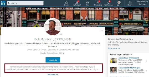
 I was warned ahead of time that the Summary section of the new profile is no longer titled Summary. In fact it’s not in the body of the profile; rather it’s in the Snapshot area (photo above, boxed in red), and…a visitor can only see the first two lines of it. Therefore, it’s important that you utilize these two lines to grab the reader’s interest.
Read The 39 most important words in your LinkedIn Summary*
My only concern here is that visitors won’t realize that they need to click “See more” in order to…see more. Get used to clicking “see more,” as LinkedIn has done its best to condense the profile as much as it could.
I heard there was talk about removing the Rich Media areas (under Summary, in Experience and Education), but LinkedIn held off on that silly idea. Rich Media is still there.
2. What About Those Three Dots and Contact and Personal Information?

The Three Dots. The placement of actions like removing connections, unfollowing, requesting and writing recommendations will take some time for recipients of the new UI to get used to, but the information is nicely placed.
Note: your profile only shows the top two commands. To remove a connection, request a recommendation, etc. you must go to that person’s profile.
The same applies to the Contact and Personal Info section which drops down to reveal the information visitors would see if they choose the Info tab on the older version. Unfortunately the public URL for someone is located in this area, instead of in plain view just below one’s photo.
3. Highlights and Posts and Activities

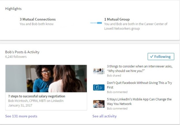
Don’t blink when you near these sections because there’s a lot of information packed into these sections. In Highlights visitors can see our mutual connections, as shown. However, in order to see all my connections, one must click on this area and choose “All.”
Bob’s Posts & Activities. This is where a great deal of information is located, including my articles, posts, and all activities. Articles are ones I’ve written on LinkedIn; this is straight forward. What is not straight forward is the difference between posts and activities. As far as I can tell, they’re one in the same.
Note: Unlike the older version, only one article is displayed. In the older version, three were displayed, which meant you had to have at least three written on order not to be embarrassed, but I’m sure LinkedIn’s motive behind this wasn’t to save you from embarrassment.
4. The Experience Section
UPDATE
How often does LinkedIn reverse its decisions? Not often is the answer.
The good news is that LinkedIn has reversed it’s decision of showing only the first position in its entirety and truncating the previous ones. On May 26th, 2017, I noticed that LinkedIn corrected this faux pad. Now we can see most of the positions expanded.
This is great news, as visitors to your profile might not have known that they had to click “See More” in order to see your other positions.
Read this article to see my approval of this “change-back.”
5. Pause
Have you noticed that I’m talking about the new profile in a specific order, e.g. Summary followed by Experience. With the new profile, you cannot move the sections around.
This is a problem for me, because I prefer to follow my Summary with my Skills and Endorsements. I also have a problem with authority, and this is a total power play by LinkedIn, in my opinion.
Note: When I asked LinkedIn why it prevents its members from moving their profile sections, they said the way it’s structured is the way recruiters prefer it.
6. Education
Not much to report here. Because this section can’t be moved, this may cause a problem for students and recent grads.
7. Volunteer Experience
What surprises me is that this section comes before Skills and Endorsements. This section hasn’t changed much, save for the fact that visitors must expand each volunteer experience. I wonder what LinkedIn was thinking when they made this decision for me.
8. Featured Skills and Endorsements & Recommendations

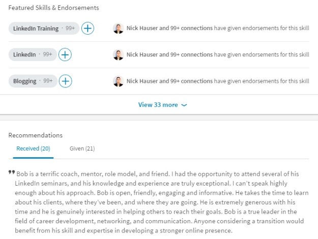
Finally we see the skills and recommendations. First, visitors notice that only the top three skills are displayed. Secondly, only one endorser is displayed, whereas with the older UI, at least ten endorsers were displayed. This is not detrimental. In fact it can be seen as a positive when we’re talking about slimming down the profile.
What I find very promising is that Recommendations are just below Featured Skills and Endorsements. This is significant because in the older version, Recommendations was anchored at the bottom of the profile, giving me and others the feeling that perhaps this section was on its way out. At the very least, it was given less prestige; much like skills are given now.
One of my valued LinkedIn connections, Rich Grant, points out that in the older UI we were able to see from which companies the recommendations came. Further, in the Experience section recommendation givers were displayed with a link to the recommendation section for said people.
9. The Rest
Certifications, Organizations, and Projects are listed under Accomplishments. Prior, they had their own real estate, but now they’re buried under this header. And yes, they must be expanded like most sections.
Do you remember painstakingly listing your professional and personal interests under Interests? Well forget it; that section has been retired, as far as I can see. Shame.
Following includes my activities and interests. This is redundant information because visitors will see the section called Bob’s Posts & Activity directly below my Highlights section.
It makes sense that LinkedIn shows the influencers, companies, groups, and schools I’m following, all of which visitors must expand in order to see more of each.
Is Less Better?
I think you’ll agree when you receive the new UI that in some cases less is better. However, the inability to move sections around as you once had the ability to do; and making you have to expand most sections, including the Summary–you might find the older version more to your liking. Or you might appreciate the lighter version of your new profile. The jury is still out for me.
If you want to learn more about LinkedIn, visit this compilation of LinkedIn posts.
Photo: Flickr, Eva Woo


Pingback: Great news! LinkedIn returns the expanded Experience section | Things Career Related
when they abandon the Answers/questions section this site lost my interest
LikeLike