
I consider myself to be a fair guy. When LinkedIn does right, I complement them. When they do wrong, I criticize them.

This time LinkedIn made a smart move by joining multiple job titles to fit under one company icon (see below). But in the same fell swoop, LinkedIn truncating each position. More on this later.
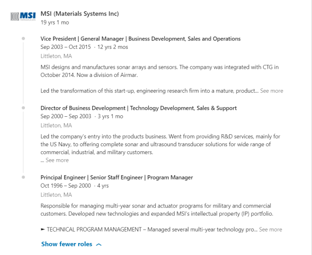
Good move: joining positions
![]()
Previously, if you wanted to list all your positions at one company, you entered a “new position” and your company’s icon appeared for each position. This got confusing, because at quick glance it appeared as if you worked at two, three, four, or more companies.
Note: the process is still the same in terms of entering your titles, but LinkedIn shows the line joining the positions, displaying the company icon only once.
My solution to the multiple-icon fiasco for one company was to write another positions within the original entry and separate them with a line. Unfortunately, it limited how many characters I could use for each entry.
Another problem with showing multiple positions under one entry was diminishing SEO. (Titles are weighed among the heaviest of the areas on your profile.) So it was to one’s benefit to enter as many job titles for each company. Still, it looked confusing and and disorganized.
MEH: truncating positions…again

Remember when LinkedIn showed a person’s first position and truncated the rest of them? I do, and I thought it was a terrible move. Here’s what it looked like below the full first job description:

Well this brilliant move more than a year ago must have disappointed LinkedIn members, because LinkedIn went back to expanding all but a few positions, which I loved. I just couldn’t look at a profile which only displayed titles, companies, and tenure of employment.
When LinkedIn reversed its decision, I wrote this in a post:
The good news is that LinkedIn has reversed it’s decision of showing only the first position in its entirety and truncating the previous ones. On May 26th, 2017, I noticed that LinkedIn corrected this faux pas. Now we can see most of the positions expanded.
LinkedIn meets its users halfway
Currently LinkedIn has decided to truncate people’s positions to a point (approximately 60 words). This includes your first position, as well. Visitors to your profile can still see the rich media areas, but there’s still that thing about clicking to “See more” that leaves me sour.
Note: these 60 words have to be grabbers. I suggest they’re written in first person point of view, contain a value statement, and are kept to three lines at most. Three lines at most because you should show a bulleted accomplishment. An excerpt of my first job description reads:
I’m more than a workshop facilitator & designer; I’m a career and LinkedIn strategist who constantly thinks of ways to better market my customers in their job search. Through disseminating trending job-search strategies, I increase our customers’ chances of finding jobs.
HIGHLIGHTS
► To meet the needs of my customers, I have developed more advanced workshops that have garnered high praise
I get it. LinkedIn wants a streamlined profile that doesn’t take up too much space. And the nice move it made by joining positions might not look as appealing if the position are expanded. I guess I’m a traditionalist who likes to see a profile that resembles a resume outline.
What do you think about these two changes? I’d love to hear your opinions, even if you disagree with me. Especially if you disagree with me.

